Showing posts with label eye shadow. Show all posts

Friday, July 27, 2012

Review: Chanel Illusion d'Ombre in Rivière from the Nordstrom Anniversary Sale.

Like the rest of the Chanel products offered by Nordstrom for their Anniversary Sale, Rivière was originally sold exclusively in Asia. It was enthusiastically reviewed on Café Makeup and The Non-Blonde, so I made a beeline to the sale to buy it.

Rivière is a beautiful minty blue-green shade. It's silvery-shimmery with a very pearly finish. I know that women of a certain age are supposed to be careful about pearly finishes and totally avoid glitter, but I think a little bling close to the lashes or a light wash on the lid is appropriate, and the good news is that with this creme/gel formula, the pearliness stays put. It doesn't go all Urban Decay and wander off, only to end up highlighting my crinkles.

The texture is a very fluffy gel//creme, unique to Chanel, which can be applied as a shadow, a liner, or a liner that is blended out for a beautiful smoky eye.

The little pot comes with a small synthetic brush, so you have the option of using the brush or applying the shadow with your fingers.

The bottom of the pot and the little brush
Staying power is good; I use concealer as my eyeshadow base, and the Illusion d'Ombre shadows last all day on me.

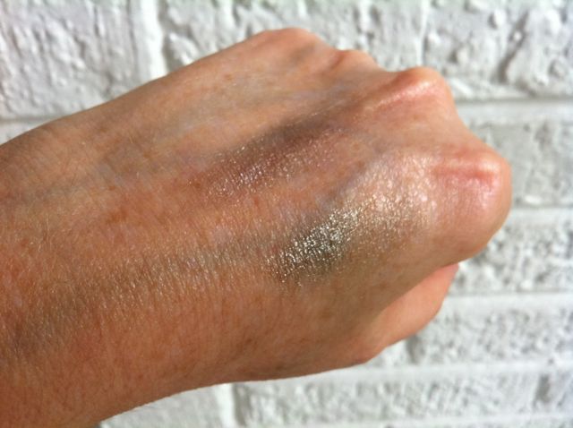
Chanel Rivière swatched heavily on my inner arm. Please forgive the terrible lighting! The weather hasn't been cooperative this week, so I had to take the picture indoors on a cloudy day.

My reaction to this color? Definitely mixed. I love the idea of a blue-green color; it's a nice change from my usual beiges, and I find that teal eyeshadow brings out the green in my hazel eyes.

But I find this shade almost magically impossible to apply evenly. Rivière is much more pastel than the Illusions d'Ombres I've tried, and I'm finding it hard to figure out how much to apply. It's hard to apply enough so that it shows, but not so much that it balls up on my eyelid. 

I'm also having difficulty imagining whom this shadow would flatter. I think if you're very fair-skinned and look good in pastel shades of makeup, this shade might be beautiful on you. But I'm fair, and I had difficulty making the shadow show.


I fully intend to keep playing with this shade, and I'll also try it on my daughter, who patiently lets me use her as a guinea pig. But for the moment, I can't recommend this shadow.

Also? Chanel prices are always ridiculous, but the Illusion d'Ombre Riviere eye shadow costs $36. For that price, I say it's not worth the money. Illusion d'Ombre shadows are wonderful, and I definitely recommend them--just not this shade. 


Friday, July 20, 2012

Links for a lazy weekend II

So, the week is over, and both my children have their learner's permits. I will not go into the drama that that particular accomplishment entailed ... suffice to say that I'm having a well-deserved beer and looking forward to some relaxation, grilling, hanging out with friends, and a matinée of a couple of restored Méliès films. If you're trying to have a relaxing weekend, too, try pairing the following posts with your beverage of choice.

If you ever want to work up the nerve to wear anything ... a mohawk, say, or a cute blouse from H&M, or a pair of shorts because even though you're middle-aged, it's pretty effing hot out--and you need a pep talk--read this post by Eve at xoJane.

Just in time for beauty bloggers and others of you heading to New York for BlogHer, Xiao of Messy Wands has written a guide to makeup shopping in Manhattan.


I thought being middle-aged means everything I know is wrong. But can it be true? Matching lips and fingertips are back in style? Somehow I find that comforting.

Elizabeth Arden is one of those brands that I routinely write off as old lady and boring. Leave it to the British Beauty Blogger to convince me to take a second look. I mean, eye shadows that provide anti-aging benefits? Genius.


Katherine of Not Dressed as Lamb shared her thoughts on aging. Here's a teaser:

I won't kid myself that I have Cameron's legs, Thandie's beautiful skin tone or Dita's tiny waist, but I won't even consider comfort without style until Gwyneth does.

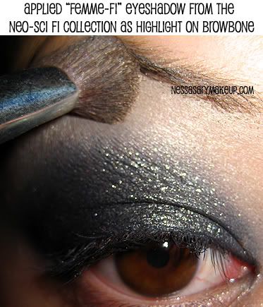
Vanessa of NessasaryMakeup gives a fantastic step-by-step tutorial on doing a dramatic smoky eye.  (She also has a nice chart of where to apply eye shadows.)


Want to get into meditation but don't have time? And anyway, meditation would take away from the time you spend looking at pretty things? Check out Chanel makeup director Peter Philip's latest video. Shiny!


I'll work on some more reviews of my Nordstrom anniversary goodies.

Meanwhile, Mesdames et mademoiselles, cultivez vos jardins!

Wednesday, July 18, 2012

Yves St. Laurent to offer an exclusive eyeshadow quad on Facebook [UPDATED]

On Thursday,  July 19, YSL will release a new, limited-edition eye shadow palette, "Devoted to Fans," on Facebook. 

The "Devoted to Fans" quad was produced to thank YSL's Facebook fans. YSL claims that this palette is "the first exclusive entirely digital product for Facebook fans." 

Only 1650 pieces will be produced world-wide, with 500 of these available in the United States. No word yet on price or what the logistics of the sale will be, although you have to have "liked" YSL to be able to buy the palette.

Do I need yet another eye shadow quad? No, I do not. Do I predict a crazy stampede? Yes, I do. Am I fascinated by major high-end cosmetics companies not just marketing, but actually selling cosmetics on Facebook? You bet.

UPDATE: OK, here's the scoop. The quad costs $55. It's sold through YvesSaintLaurent.com. To get it, you have to "Like" Yves Saint Laurent Fragrances and Beauty on Facebook. Then click through the icon of the palette and it will take you to the YSL site.

Monday, July 16, 2012

Review: Chanel's Rives Eye Shadow quad (35)

I came home from Nordstrom with the complete Anniversary Exclusive collections from Chanel, Dior, and Bobbi Brown. I'm planning on reviewing every item between now and August 6, the last day of the sale. Nordstrom card holders have early access to the sale, which doesn't start officially until July 20.

Chanel Rives 35 indoors by lamplight
I thought I'd start by reviewing the Chanel beauty exclusives, because they received the least amount of press. This collection wasn't pictured in the Nordstrom Anniversary Sale catalog, and I've heard that some Nordstroms only received half a dozen or so of each item.

The Chanel Rives 35 eye quad, originally available only in Asia as part of this spring's Fleur de Lotus collection, is the unloved stepchild of the collection. It hasn't generated much buzz, even among Chanel fans.

Rives features four shades of brown and a white. Even die-hard Chanel fanatics are probably wondering whether it would be worth it to buy Yet Another Chanel Neutral Eye Quad. Are these colors unique and special enough to justify Chanel's ridiculous prices?

I'm a huge fan of neutral eye shadows--I really prefer them for those of us past our first youth. They're universally flattering, and they can be light and subtle or dark and dramatic.  As a result, I've accumulated a scary number of neutral Chanel quads.

Poppy's Chanel eye quads.

I hate to say this, but I find the Rives quad unique. Some of the Chanel neutral shades are a bit murky (Prèlude and Enigma, I'm looking at you) but the shades in Rives are sheer, straightforward browns with a beautiful shimmer and without a hint of plum or gray. I think they'd work with every eye color and skin tone, whether your complexion was warm, neutral, or cool.

As with most Chanel quads, pigment varies from shade to shade. In general, the finish is sheer and the shades are blendable. The lighter shades are meant to be used as a wash and don't leave a lot of pigment. The white looks chalky in the pan, but applies as a wash of sheer, shimmery lightness. The darkest shade is designed to be used as a liner and is much more heavily pigmented.

With makeup fanatics, it's a cliche that the applicators that come packaged with eye shadow and blushes are complete garbage, and should be immediately pitched. This is especially true of sponge-tipped applicators. And it's true that the small, hard black sponge-tipped applicators that come in American Chanel quads are horrible.

However, I got my best results applying these shadows with the plush sponge-tipped applicators they came with. I use a silicone-based concealer as a primer, and I find that other, very pigmented shadows (e.g., Urban Decay or MAC) grab the primer so hard that they become difficult to blend. Not these shadows. They're so soft, it's like working with confectioner's sugar. They blended beautifully when I applied them onto primed eyelids with the sponge-tipped applicators.

Swatches


Here they are in the early morning light. I applied concealer first. For the left four stripes, I used a brush to apply. I started with the lightest shade and worked my way up to the darkest. Unfortunately, the white shade doesn't show at all. You can only see a hint of the shimmer.

Chanel Rives 35 quad, applied over primer (left) with a brush, and (right) with the sponge-tipped applicator
The four stripes on the right are swatched fairly heavily with the sponge-tip. As you can see, the white shade shows up much better.

Here's the quad, outdoors in morning light. The sun has finally come out enough to reveal some of the shimmer.

In this picture, I swatched all four shades on the paper, so again, it's impossible to see the white.

It's rare that I use all four shades in a quad, but these shades work beautifully together.

To buy, or not to buy


Rives is much prettier, less murky, and works better with my fair skin and hazel eyes than either Prèlude, Enigma, or Dunes. This quad is definitely worth a buy--if you're comfortable paying $58 for four eye shadows, and don't, like some people I know, already own 5,000 shades of brown eye shadow.

I don't know whether these are going to sell out, so if you're interested, call Nordstrom. The pre-sale started July 11th; the sale officially starts July 20th and ends August 6th.


---

Elsewhere:


The entire Fleur de Lotus collection is previewed on Rouge Deluxe.


Another review, from a Singapore beauty blogger.

Thursday, July 12, 2012

I've just invented a new acronym, NASII, which stands for Nordstrom Anniversary Sale induced insanity

OK, it doesn't look like much--NASII--but it's pronounced nay-see to rhyme with crazy, which is pretty much how I acted.

So let me get you up to speed.

First of all, until July 20th, the Anniversary Sale is only available to Nordstrom card holders. You can't even access that section of their website without typing in the last four digits of your Nordstrom credit card number.

I wanted to grab some pictures and maybe find out whether Nordstrom was actually offering Chanel's formerly-exclusive-to-Asia Fleur de Lotus collection, so I dug through my box of rarely-used credit cards, looking for my Nordstrom card. And I couldn't find it.

Because I was a makeup hoor* on a mission, I called customer service, where I was told that they had no record of my having a card. So I applied for a new one.

Then, after a visit to the gym, where my daughter hummed a little hum and pedaled 20 miles on a stationary bike without breaking a sweat and I was reduced to a limp, sweaty, incoherent rag by my personal trainer, we cleaned up our act, fueled ourselves with Mocha smoothies (caffeine and protein FTW!) and headed to the Nordstrom at Old Orchard mall.

Where I promptly lost. my. mind. I've shopped the Anniversary Sale online, but this scene was beyond exciting. It was electric. Not ridiculously crowded, and with lots of sales associates ready and willing to help out. But with sections of the store draped off as seductive little private shopping enclaves, it's very easy to lose it.

Don't believe me? Well, see these collections?

Dior


Chanel


Bobbi Brown


I bought every single item.

And then escaped to the relative sanity of the shoe department. And yes, I understand the irony of calling the shoe department of the department store that sells more shoes than any other--during a sale where merchandise is marked down 30 percent--sane.

I don't know about you, but I blame my trainer.

Swatches and reviews to come. 


* Deliberately misspelled in a feeble attempt to clean up my act.

Monday, July 11, 2011

Chanel Collection Byzance Fall 2011 makeup collection


This spring, I spent a while kicking myself for not having gotten my mitts on Chanel's Ombres Perlées eyeshadow palette while it was still available. The colors looked perfect for hazel eyes.

So I went all Scarlet O'Hara and shook my fist at the sky and declared that as God was my witness, I was never going to miss the opportunity to score a Chanel limited edition cosmetic ever again.

So when I discovered the fall collection was up at Chanel.com, I ordered pretty much every limited edition color they had. Want to see?

Let's start with the lips.


Somebody really needs to get rid of that ancient Shellac manicure

I got a Rouge Allure in Rouge Byzantin, the lip pencil in Rose Cuivre, and a LE Glossimer in Braise (158).

As you can see, the Byzantin Rouge Allure is almost fuschia. After so many years of my-lips-but-better pinky brown glosses, it looks ... very bright. I'm trying not to freak out over it. After all, Sandra Bullock wore hot pink lipstick the night she won her Oscar. And Taylor Swift always wears bright lipstick. Which means the bright lipstick trend will work its way into the general public as sure as rain rises up the legs of my jeans. And for "general public" read "women of a certain age." Yes, even us.

(Deep breath. It's OK. You start small. You apply the lipstick, blot it to tone down the color, then add a little gloss.)

On the other hand, Braise is a much more wearable sheer light red--very lightly brown-red, actually--with gold microglitter.

The lip pencil is from the regular collection. It's not a LE, but I thought it would look good under the Glossimer. And it does.

OK, let's talk eyes. I also got the limited-edition eye shadow quad in Topkapi with four shades: a warm medium brown, a light taupe, a dark chocolate matte brown, and a gold.


Here it is swatched. As you can see, all the shades are quite shimmery, except for the chocolate brown.


I'm not going to pretend that these are basic, every day colors, but I can easily imagine getting a lot of use out of all the colors (well, except for the gold. I'm not Mr. T.) But the gold looks beautiful as a highlight on the inside corner of the eye, in the center of the lid, or under the bottom lashes.


I also got two shades of the Illusion D'Ombre cream eyeshadow. I must say, I can't wait to play with these. They are so gorgeous, and they have a wonderful mousse-like texture (actually, I'm sure this is what the Maybelline Dream Mousse eyeshadows were like.)

I got Epatant, the dark, charcoal green pictured above, and Illusoire, a deep plum. I forgot to take a picture of Illusoire, so here's the photograph from the Chanel website.

In this picture, I had just lightly touched my finger to each shade to swatch them.


 Illusoire on top, Epatant on the bottom

As you can see, these shades can be quite subtle and lovely.

The makeup artist at the Chanel boutique in Chicago showed me some of the Illusion D'Ombre shades applied with a brush, and they are gorgeous. Really incredible looking. (I was very taken with Ebloui, a lighter shade of mauve-lilac, but I didn't buy it.)

There are two limited-edition shades of powder blusher: Joues Contrast Rouge in Rouge and Or. Which means red and gold. And they are:


Here's a close-up of each shade:


Amazingly enough, they can be quite subtle. Especially for colors that look like two-thirds of a traffic light, No, really. I first applied them to my hand with my Lancome skunk brush and I couldn't even see the colors. I went over my original application using the brushes that came in the compact, and the colors were still pretty subtle. Finally I went all out, applying the gold shade and then lots of red on top, for a full-on scarlet fever look. And even then, it's not as clown-like as you'd think.


Finally, I bought a bottle of Peridot nail polish. Lately, Chanel polishes always seem to start a crazy lemming rush, and I wanted to grab a bottle before they were sold out. (In fact, now that I think about it, I was inspired to hit the Chanel website in the first place because I saw a bottle of Peridot for sale on ebay for some ridiculous amount of money--$45 or so.)
The picture in the eBay auction was what you'd expect a polish called Peridot to look like--a light yellow-green. In actuality, the polish flashes teal and gold and is never actually stays still long enough to look green, if that makes sense. I don't know whether I'll ever want to wear it; I may exchange it for a bottle of Quartz, which looks like Particulière with very fine shimmer.

At any rate, I tried to give you a sense of what Peridot polish looks like:


But I finally decided I needed to let you see the bottle in action. So here you go--my first mini video review.


To sum up, I'd say the entire collection is drop-dead gorgeous, but not every product is worth buying. Illusions Dombre are definitely worth a look; so is the Topkapi Quad, if you don't already have a ton of brown, beige, and gold shadows. The gold shadow is gorgeous and can be applied lightly or sponged on for a very dramatic effect. The nail polishes are interesting, and I'd suggest taking a look at Graphite, a medium gray with lots of silver microglitter, or Quartz, a taupey-beigey brown with tiny particles of micro glitter. Both are probably more wearable than Peridot. The limited edition blushes are interesting, and if you're a real makeup maven, you'll want to add these unique shades to your collection, but as for wearability and general usefulness. And the lipsticks are beautiful, but probably not worth getting.

(Just watch as a huge lemming rush starts over gold blush and fuschia lipstick!)


Wednesday, October 20, 2010

Is Urban Decay seriously trying to bring back body glitter? Seriously?


Because I am a famous beauty and style blogger as well as a compulsive shopper, I don't just get the usual email from online retailers. I also get flooded with PR pitches as well as newsletters from every beauty and style board I've ever joined. Which means that every time a new product comes out, I'm going to hear about it at least three times.

Which is three times more than I want to hear about Urban Decay's "new" highlighting product.

I remember when I first moved to the suburbs and had to deal with massive numbers of trick or treaters. At the end of the night, there were a few bold teenagers who were willing to risk being told they were too old to go trick or treating.

I was happy to see them, because it meant I'd be able to dump the last of the candy--less for the kids who just showed up, more for the kids who had made at least some effort to dress up, even if it was just a quick insta-costume.

Now, ten years ago, the insta-costume for teenaged girls was to put a couple of flocks of baby butterfly clips in their hair and smear on a lot of body glitter.

Can it be 2000 again already?

If you can stand to spend the 1:30, watch this video as one of the co-founders of Urban Decay applies sparkly highlighter all over a young woman whose smooth, perfect skin makes her look like a Bratz Doll, albeit slightly more animated.

http://www.urbandecay.com/index.cfm?LID=NEW2766

Ladies, I know you're not even tempted. Just use this video as an object lesson, and continue to say no to glitter.

I swear, if I wake up screaming in the night, it'll be because I had a nightmare about being caught in public with glitter down the middle of my nose. And on my neck. And sternum.

Urban Decay, you have a lot to answer for. I mean, come on--weren't you just selling all that glittery makeup, like eight years ago? Like I'm going to fall for that played out shiznit.

Lucky for you, your pencil eyeliners are the bomb-diggity.

Monday, June 28, 2010

Finally!--an Urban Decay palette for grown-ups.

Urban Decay makes some of the nicest eye shadows out there: the colors are gorgeous, and the texture is soft and blendable. I've loved them for years, and over the years, I somehow managed to accumulate a bunch of UD palettes.

It took a while, but I finally realized that Urban Decay eye shadows are too glittery and/or shimmery, and most of them aren't appropriate for a woman of a certain age. It also finally dawned on me that UD repackages the same colors in their palettes over and over again.

It was time for me to back away from the UD palettes. (Or buy them as presents for my daughter.)

But I just found out from The Best Things in Beauty that in July, Urban Decay will be releasing a new set of shadows in neutral shades. They look really gorgeous, and six of the twelve shades will be new!

The collection will include Sin, Naked, Sidecar (which formerly appeared in the Book of Shadows, Volume 1) Half Baked, Smog, and Toasted and the followed new shades:
  1. Virgin--Satin chamois
  2. Buck--Matte nutmeg
  3. Darkhorse--Bronze patina
  4. Hustle--Plum brown satin
  5. Creep--Onyx with gold sparkle
  6. Gunmetal--Gunmetal gray with silver glitter
The Naked palette will sell for $44 and will include a double-ended 24/7 pencil in Zero (black) and Whiskey (brown).

Thanks to The Best Things in Beauty's Charlestongirl and Tavia of Chic Profile for the head's up.

Monday, June 21, 2010

Eye shadow as contour: the theory

I'm probably getting really repetitive on the subject of neutral eyeshadow, but Sephora keeps filling my mailbox with catalogs showing models wearing truly outlandish colors--glittery turquoise stripes were featured in the latest--so it doesn't look as though I'll be shutting up any time soon.

So I'll say it again: neutral eye shadows are fantastic on women of a certain age. They do what eye shadow is supposed to do; shadow and sculpt the eyes to make them look bigger, brighter, and more expressive.

They do this by contouring the eye area. Now, it took me a long time to accept the fact that I was going to talk about using eye makeup to contour the eye area, because the old school notions of contouring seem hopelessly out of date.

You know what I mean when I talk about contouring the face with makeup, right? It's a makeup technique where you apply lighter makeup where you want a feature to appear higher or more prominent, and darker makeup where you want a feature to appear deeper or less prominent.

It's frequently used to make noses appear straighter and narrower, or make cheekbones look more prominent. But here's the thing about contouring: it's hard to make it look natural. It was first used in stage makeup, where the audience is very far away from the actors. Then it was used in black and white movies and stills, where you have dramatic lighting and a general aura of glamorous artificiality. But even then, makeup artists had to know what they were doing. Back then--and right now--when you shade and highlight an area, it's all about blending and soft, subtle shades.

As an example of what I'm talking about, take Marlene Dietrich. Her entire face was nothing but makeup and lighting. Here's a photograph of her standing next to Josef von Sternberg, the director who made her a star.


Notice the fairly flat planes of her face. Now look at her with von Sternberg's trademark lighting and a full face of contoured makeup:


I'm not a makeup artist, and I don't know how to do stage or film makeup, but it's pretty clear that Dietrich is wearing way more makeup than even the average Hollywood star of the 1930s--and they wore plenty.

Check out the contouring. I'm no expert, but I can see that a lighter shade of foundation is blended down the middle of her nose, with a darker shade along the side. In the first picture, it looks like she's wearing highlighter under her eyes, and in the second, it's obvious that the artist used rouge to contour her cheekbones (a trick that works very well in black and white photography, but is much less successful in color photographs or real life.)

Take at Dietrich's eye makeup. Her eyebrows are the stuff of legend, so we won't discuss them, except to warn you not to emulate her. Although tweezing her eyebrows off and drawing them on again much higher up did give Dietrich a much larger area in which to apply eyeshadow.

And what eyeshadow! She's wearing a medium shade from the lash line all the way up to the brows, with a lighter shade on the eyelid and a highlighting shade in the inner corner and in a narrow line under the eye. Her crease is shaded much darker. Her eyes are very wide set, and that, added to the increased height of her brow area, means the makeup artist could apply a ton of dark shadow in the U-shaped crease to the back wedge. Her eyes were big to begin with, but the eyeshadow makes them incredible.

And Dietrich was doing this before eyeshadow was commercially available. Instead, she or her makeup artist used soot mixed with baby oil or petroleum jelly.

There, now. Aren't you ashamed that you're not taking full advantage of the lovely, hygienic ready-made shades now available in stores?

Next on The Beauty Boomer: What I Do, or, I know Poppy Buxom, and she's no Marlene Dietrich.


Elsewhere on the web:

For more on makeup in films, see the article on makeup in Film Reference


For how to look more like Marlene Dietrich, go this article in Suite 101

Tuesday, June 15, 2010

What do you mean, women don't like using maps?

Hi internet! Listen, I know I've been neglecting you shamefully lately. But I have excuses. Many, in fact.

Mr. Buxom, also known as "Counselor Whup Ass" has been out of town
ruthlessly horsewhipping Intelletual Property scofflaws
at a trial, and I've been the only parent to help with my wonderful, talented children--children whose talents involve lots of driving around and listening to music and cramming for exams and shopping for camp clothes, not to mention the camps themselves. Plus the usual groceries, laundry, cooking, mopping up spills and teenaged angst and what not.

Then there's all that volunteer bullshit I'm always whining about (see tags) like my own talented musical performances and the desktop publishing I'm doing for a non-profit even as we speak. In fact, I'm only here because I'm waiting on some proofs.

But what has suffered? MY BLOG, thank you very much. And MY READERS.

Well, listen, readers--one of the things that has been vexing me has been my printer's inability to scan anything. I had all these pictures I wanted to show you, and the stupid HP All-in-one had become a Part-in-one. And then, a couple of weeks ago, it even balked at printing and morphed into the world's largest paperweight. So I did the smart thing. I checked out the reviews of the HP PhotoSmart C4280 All-In-One printer on Amazon. And I discovered that's it's not me; it's HP.

So I bought a new printer. And I just scanned my first scan! Voila:


Now, other than playing with the new printer, why the scan?

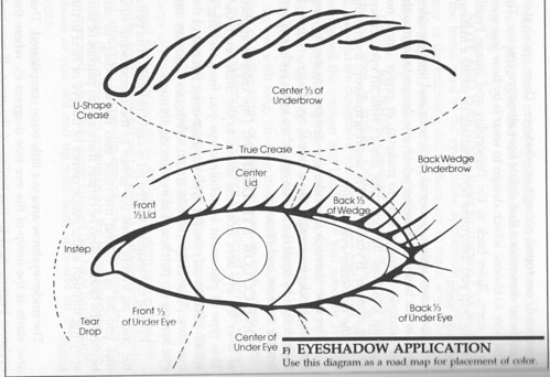
It's to even the playing ground. Because a lot of the time, makeup instructions are written by makeup fanatics for makeup fanatics. I mean, I love MakeupAlley, but with all the talk about the back wedge,  tightlining, and waterlining, those women aren't speaking English.  If you aren't all makeup, all the time, you won't know what they're talking about.

Even makeup fanatics who write books forget to talk down to their readers. Where's Makeup for Dummies when you need it?

But Gentle Reader(s), this is Makeup for Dummies. And I promise, I'll never forget to talk down to you.

So check out this map. Study it. Learn the terminology. Refer back to it. Copy it onto the top of your left hand with a Sharpie. Tattoo it to the small of your back. Be the ball, Danny.

And get ready for Eye Shadow 101.

Sunday, May 16, 2010

Ten Things

Blackbird posted recently about ten things that have been good at the office. I'm coming down with something, so at the moment, my office is my king sized bed--but I have 10 good things to tell you about:

1. On the personal front, in the last two weeks, I've survived: a trip to the dentist, two school concerts, three annual meetings, three non-annual meeting-related ladies' luncheons, a Girl Scout's Cadet's flying up ceremony, an engagement party, and Mother's Day. Internet, that is a LOT of irreproachably ladylike behavior from the somewhat loud, obnoxious, and irreverent likes of me.


2. Jen Lancaster's latest book, My Fair Lazy, came out on May 5, and it's already a best-seller. I appear as a character in this book, which means I'm even more famous than I was a month ago. You'll be glad to hear that fame hasn't made some kind of monster of me. I'm pretty humble about the whole thing. But not so humble that I wouldn't want to make sure that the internet realizes Jen didn't actually make me up.

3. Physician's Formula matte eyeshadow quads are rocking my world. They're dirt cheap and the quality is excellent. They're so soft, subtle, blendable, and fun to play with that I'm doing a full-on three-shades-of-eyeshadow dealio every day--even when the only time I see another human being is when I'm wheeling out the recycling bin.

4. Milani has a retractable lip pencil that has stolen the crown from my previous faves, Chanel Nude and Prestige Angora. It's creamier, more of a my-lips-but-better-shade, and I don't have to sharpen it. Mind you, I don't wear it as a liner. I use it all over my lips as a base for gloss. And at $3.49, it's cheap, cheap, cheap.

5. I snagged this pair of Fly London purple Mary Janes on Amazon for something like $50. They are so comfortable! Who cares if my daughter asked me why I always wear such silly shoes? And anyway, it could have been worse. I could have clicked over to Gravity Pope and bought these:


so really, I don't know what her problem is.


6. The Garnier Nutritioniste moisturizer that I love so much that I'm on my fourth bottle? And was afraid had been discontinued? Has NOT been discontinued. The packaging was re-designed. I snagged five bottles of the old design for $2.49 each. (Although the shipping costs were a heinous $14.50.)

7. Lancome's Divine Lasting Curves curling mascara actually works. It is perfect for keeping in my makeup bag, because who wants to carry around an eyelash curler? (This is a rhetorical question being asked by the woman who found three eyelash curlers in her bag the last time she cleaned it out.)

8. Lancome also has an eyeshadow that I got recently as a GWP and just adore. So should you if you have hazel//green eyes. The shade is  called Designer. It's a olive green shade with lots of shimmer--but it's incredibly subtle. I know I'm a strong advocate of a basic, neutral eye shadow, but this stuff goes on sheer and is much more subtle than it looks.

9. Kari at Fabulous Over Forty has called my attention to a root touch-up product that comes packaged like a marker pen. I can't wait to head to Ulta to try it. This sounds like a perfect product for those EEK MY ROOTS ARE SHOWING days.

10. I've accumulated a bunch of neutral eyeshadow quads to tell you about soon. I promise. (When I'm not lying here on my bed of pain, that is.) And some of them are really nice!

Friday, April 30, 2010

Just when my blogging friend blackbird is bragging about how productive I am, or, irony in action

Oh, internet, you know I love you, but I'm having a few problems with my next eye shadow post. And it has nothing to do with all the M.A.C. shadows I just bought over the internet. I am not freaking out AT ALL that M.A.C. gives their shadows all kinds of unique names like Wedge and Cork and Bamboo and Corduroy and then when you order 15 of them, it tuns out they're all exactly the same color.

(Some makeup expert I turned out to be.)

Also, I really want to scan in some pictures from some out of print books I have on makeup. I dug up a couple of excellent diagrams of the general eye area, with very clear instructions on where to put which shade of shadow. They would be so helpful. But I can't get my scanner to work.

Also, LPC kind of derailed me with a question about lilac-colored eyeshadow; specifically, whether it's OK for us old broads to wear it. (My answer is yes, of course, but only with due diligence about shimmer. And unless you're planning to star in a remake of Priscilla, Queen of the Desert, I'll terminate glittery lilac-colored eyeshadow with extreme prejudice.)

So I'm getting way behind on my posting. For example, I have plans to start a regimen that I'll do for an entire month, so I can report back with a truthful, objective review (albeit marred by parenthetical remarks in italics.) I bought a Murad Get the Glow! Resurgence kit, as well as a couple of other supposedly miraculous products. I was planning to post about them on May 1st, and now I'm all BEHIND.

Capital letters were designed by the ancient Romans to express FRUSTRATION.

And now I have to go to see lovely Tony at Pascal Pour Elle (he's completely adorable) to get a blow-out because I have two cocktail parties to attend tonight.

WHAT A WHIRLWIND.

Tuesday, April 27, 2010

The only eyeshadow shades you need


You know those fabulous blockbuster palettes that everyone comes out with for the holidays? Estee Lauder, Sephora, Walgreen's, you name it. A whole rainbow of colors and so many finishes: matte, satin, frosted, opalescent, glittery. How fun are they?

Great fun. But let's remember eyeshadow's primary purpose. It's not to go all Crayola 64 shades. Eye shadow exists to sculpt, enlarge, and accentuate the eye.

Say hello to the idea of Your Eyes But Better

If you want startling effects, you'll need a range of different colors of eyeshadow. But if you want to do a neutral, pretty makeup job--your eyes but bigger, brighter, more defined and more expressive--you only need three shades of shadow:

1. A light, non-shimmery base color

This shade should be about the color of your brow bone. You'll be applying it all over the eyelid, from lashline to eyebrow. This sets your concealer or primer, mattifies the area, and provides a base for the rest of your eye look.

2. A darker, non-shimmery midtone/contour shade for sculpting

The midtone or contour shade should be two shades darker than your light shade. This is where fair-skinned girls get gypped. The contour shade in the average quad is usually far too dark. You really only want it to be a couple of shades darker than your light shade. Think about the way paint companies show shades on paint strips--the difference in color should be visible, but subtle.

3. A very dark shade for lining and special effects

The dark shade should be somewhere between your contour shade and your eyeliner and/or eyelashes.

To those shades, it's also nice to add

4. A light shimmery highlight color


OK, I realize this comes as news to absolutely no one. I swear, as I type this, I'm picturing my makeup-obsessed internet friends rolling their (perfectly made up) eyes and saying "duh." After all, every eyeshadow manufacturer from Maybelline to Chanel produces a quad with four beige-to-chocolate brown shades.

Except that the companies often act as thought these quads were one size fits all, when they're really not.

Beware of Shimmer

You'll find lots of quads with absolutely gorgeous colors--except the shadows are all shimmery. Shimmery shadows are fine for certain uses, but for this natural, neutral eye, you want to shape and sculpt the lid, browbone, and crease, and you can't do that with sparkly shadows.

Also, once you have even a hint of droopiness, crepey-ness or crows' feet, you have to approach shimmery shadows with extreme caution. (This is because--to revert to my paint metaphor--you don't use high-gloss, light-reflective paint formulas on a cracked surface!)

Work with your complexion

Here's another way in which eyeshadow quads aren't one-size-fits-all: the four shades you select should relate to your complexion shade and tone. I'm not talking about eye color here; this advice holds no matter what color your eyes are.

You're using these shades to contour the area around your eyes, and they need to work with the color of your skin. As a fair-skinned, cool-to-neutral person, I've found many eye quads to be way too dark or too yellow toned. Often the lightest shade is fine, but the midtone or contour shade is the color of Grey Poupon mustard. Nothing against you mustard-colored ladies, but not only is Grey Poupon-colored eyeshadow unattractive, it looks unnatural. On me, at least.

If you're medium-to-dark-toned, you'll have to watch out for the lighter shades. Often the'll be too light, and end up looking ashy and unnatural. And if you're warm-toned, too taupe-y and cool a shade will look muddy.

Ideally all four eyeshadow shades blend together to create a soft, natural, big-eyed look--which is why I call it Your Eyes But Better.

My Recommendations

When you're looking for a set of eye shadows, it's tempting to buy a ready-made quad. But as I've already pointed out, I've never had much luck with that; it's awfully hard to escape shimmer, and the contour shade is too dark and warm a brown.

However, quads can definitely be cost-effective, as opposed to buying four single shades. Bobbi Brown makes amazing shadows, but they're $20 each, so I hesitate to order you to run out and buy four of them. Still, if you click over there to check out the colors, you'll see how soft and subtle they are. That's the look we're aiming for.

There's also the advantage that someone else has coordinated the colors for you, which is helpful if you're a beginner.

Here are my suggestions:

Drugstore Quads

Revlon's Colorstay 12 Hour Eye Shadow Quad in Coffee Bean


Physician's Formula Canyon Classics and Classic Nudes

Department Store

Clinique's Color Surge Eye Shadow Quad in Teddy Bear. Spicy and Choco-Latte are also beautiful, and would work well with people with warmer and darker complexions.


Elizabeth Arden Color Intrigue Eye Shadow Quad in Sueded Browns or Neutral Cashmeres.


Creating the perfect eyeshadow quad

As you can see, sometimes a quad has one or two or even three gorgeous colors, but it doesn't have everything you need. Once you know the shades that work best for you, it's a great convenience to fill a compact with them.

M.A.C. sells empty four- and fifteen-pan compacts. If you get a four-pan, you could fill it with shadow that work perfectly for you. This is something to keep in mind if you've tried one or two ready-made quads and found you only used two or three of the shades. A custom compact is really wonderful for travel, and it really simplifies life to open one compact and find everything you need.

My favorite eye shadow palette? Glad you asked

OK, this is definitely a case of do as I say, not as I do, because my favorite eyeshadow "quad" has nine shades of shadow. It's Too Faced's Natural Eye Neutral Eye Shadow Collection.


It has a perfect base color (top left) and the all-time fabulously wonderfully perfect crease shade for me (top middle). It also has some great shades to use as eye liner, and some shimmery and glittery shades to use for evening, so it's basically one-stop shopping. It retails for $34, but since you get nine shades, I think it's a pretty good deal.

(Confession time: I've also taken the plunge and ordered a M.A.C. 15-pan palette. Of neutral colors. Heh.)

Coming up soon: how and where to apply your eyeshadow.

Elsewhere:

MakeupGeek has two helpful videos that relate to this post, Makeup 101: How to Apply Eye Makeup, and How to Organize Your MAC Neutral Palette