You know, back in 2004, when I first started blogging--eight years ago on August 10th, in fact--blogging felt far freer than it does now. Self-publishing on the internet (which is all blogging is, when you think about it) was a new frontier. But there were a few unspoken rules.
The first, of course, was that you weren't supposed to blog under your real name. Hence Poppy Buxom, a/k/a Poppisima (a variation provided by my pal Joke--and that's not his real name, either.) It wasn't a privacy issue so much ... well, OK, a little bit of it was for privacy. But picking a blogging name was like picking a new handle for an email account: it was a chance to be creative. To play with your identity.
Also, bloggers started off as writers. Maybe not published writers, but blogging was about the words. You could put up post after post with no photographs, and nobody would complain. Can you imagine? (No photos in this post--I'm kicking it old school.)
Another rule--at least amongst the thirty-something female bloggers I was reading and/or emulating--is that you were supposed to convey a sort of artsy, slackerish image. This is probably because blogging was invented by Generation X, which has been chronically underemployed for decades now. (I realize this is supposed to be the Baby Boomers' fault, but don't look at me; I was a slacker before the term was invented.)
Another rule was honesty. You could be as confessional as you wanted. We were encouraged, nay, expected to blog about our depression, infertility, and marital woes. Which meant that a lot of bloggers were constantly whining about their problems, personal and financial.
Later we got BlogHer and advertising and domain names and twitter and Facebook pages and giveaways and sponsored posts and search engine optimization and whatnot. People started blogging for a living. But way back when, it was pretty much me talking to myself, in the company of a small circle of similarly-pseudonym-ed cronies.
Because of the general poor-me 30-something zeitgeist, I worked hard to conceal the amount of privilege I enjoyed. After all, some of the biggest names in what would be called mommyblogging were struggling financially. It seemed in bad taste to blog about my latest Mother's Day shopping spree at Neiman Marcus when bloggers I admired were putting tip jars on their blogs.
And really, what was with all the shopping, anyway? Was I completely shallow?
I suppose I was. And am. A better woman wouldn't get so much pleasure out of amassing large amounts of high end crappe. But I am no better than I am, so I do. And I gloat over my pretties like Gollum with his Precious.
This is why I stopped blogging about my personal life, and became a beauty and style blogger for middle-aged women. A lot of my real-life friends read my blog, and I was fine with that. But the game had to change when the kids at my kids' school discovered my blog.
I didn't want to stop blogging, but it behooved me to find a different subject. Something that didn't revolve around my kids. Something that wouldn't embarrass them. Something that would bore the pants off the playground bullies. Something I knew really well, like ... makeup.
Now, I realize that as we age, makeup has diminishing returns. I can spend 20 minutes putting on primer, foundation, concealer, highlighter, contour, blush, eyeshadow, eye liner, mascara, brow color, lipstick and lipgloss, and my 15-year-old daughter will swipe on some lip balm and look 100 times more beautiful than I do.
But age has some compensations. When I was a teenager, I lived and breathed fashion magazines. Vogue, Harper's Bazaar, Glamour, Mademoiselle, and Ingenue. (Does anyone else remember those last two?) They were my bibles. I couldn't afford to buy anything in them, but I pored over them.
I knew that one day I'd come up with the money, and I'd go to New York, shop at Bonwit Teller, get my hair done by Kenneth, and eat lunch at La Côte Basque.
Oh, well. I guess it's too late for any of that. But by God, I can still buy Chanel makeup.
You may be wondering, what's with the navel-gazing, Poppy? It was Perilously's Pale entry into the Most Expensive Face competition.
Anyone who's hung around here for any length of time realizes that I love high-end department store makeup. For me, makeup is a luxury, and I really prefer it to feel luxurious. I'm not opposed to drugstore brands, but the packaging rarely thrills me.
No, I long for the stuff you buy at Neiman Marcus, Nordstrom, and Saks. I love the the advertising campaigns, the way the department stores set up the counters, the packaging, the loud snap of the compacts when you open and shut them, and those smells. I love it all.
But I still feel a little guilty about my deep interest in such a shallow subject, not to mention the vast sums I spend on what is, after all, just makeup.
And that's why I get a vicarious thrill out of reading about how someone else spent over $3,000 on one day's face products.
With my Garnier moisturizer, L'Oreal mascara, and Maybelline concealer, I'm nowhere near that figure. And when the blogging sans-culottes go looking for beauty bloggers to take to the guillotine, I might just squeak by.
Showing posts with label makeup. Show all posts
Showing posts with label makeup. Show all posts
Monday, August 6, 2012

Thursday, July 19, 2012
Review: Chanel's Fleur de Lotus Joues Contraste blush
I came home from Nordstrom with the complete Anniversary Exclusive collections from Chanel, Dior, and Bobbi Brown. I'm planning on reviewing every item between now and August 6, the last day of the sale. Nordstrom card holders have early access to the sale, which doesn't start officially until July 20.
 American makeup fanatics started lusting over Chanel's Joues Contraste in 69 Fleur de Lotus when it was released in Asia in February, 2012. If the posters on the Makeup Board at Makeup Alley are any indication, this is one of the most eagerly-anticipated items in Nordstrom's Anniversary Sale Chanel collection. So it was with great anticipation that I opened my compact--only to discover that I appeared to own its twin.

Placed side to side, my dirt-cheap Maybelline Dream Bouncy Blush in 20 Peach Satin (which retails for $7.99, but which I bought at CVS with ExtraBucks) seemed identical to my ridiculously expensive Fleur de Lotus, which retails for $43. Here they are out of direct sunlight.
Hmmm ... on second thought, the difference shows up better in this picture than it does in in the sun. The Chanel is showing up pinker and shimmier, and it is.
I applied the Maybelline with a taklon foundation brush and blended it down, but it's slightly more opaque than the Chanel. I applied the Chanel with the brush in the compact. You can see my freckles much more clearly!
On my arm, I used a the foundation blush to apply the Maybelline, which is way it shows up so well. For the Chanel, I used the brush in the pan, going over and over to make sure there was good color pay off.

Fleur de Lotus is a beautiful coral-with-pink shade that would flatter complexions that are anywhere from porcelain pale to medium, and cool to warm. It applies very sheer, but can be built up. The brush it comes with is very soft and makes precise application difficult. For more color pay off, it's best to use a dedicated blusher brush. As for the shimmer, it really doesn't show on the skin. I don't own either Benefit's Coralista than Nars Orgasm, having swapped them both, but as far as coral blushers go, my impression is that Fleur de Lotus is more like Coralista than Orgasm--very soft and wearable, with no glitter, just a rosey shimmer. In fact, Fleur de Lotus shade reminds me of Chanel's Distraction nail polish, which is in heavy rotation this summer. I expect the same will be true of Fleur de Lotus.
---
Elsewhere: My reviews of the rest of Chanel's Nordstrom Anniversary exclusives:
Quadra Eye Shadow in 35 Rives
Illusion d'Ombre in 87 Rivière
Stylo Yeux Waterproof in 86 Beige Clair
Aqualumière Gloss in 80 Alizé and 81 Roselin


Placed side to side, my dirt-cheap Maybelline Dream Bouncy Blush in 20 Peach Satin (which retails for $7.99, but which I bought at CVS with ExtraBucks) seemed identical to my ridiculously expensive Fleur de Lotus, which retails for $43. Here they are out of direct sunlight.
 | |
| Maybelline Dream Bouncy blush in 20 Peach Satin on left; Chanel Joues Contraste in Fleur de Lotus on right |
Hmmm ... on second thought, the difference shows up better in this picture than it does in in the sun. The Chanel is showing up pinker and shimmier, and it is.
Swatched
Both blushes appear scary-dark in the pan, but both apply and blend down to a very wearable coral shade. |
| On the left, Maybelline, on the right, Chanel. Nothing else on face but my morning moisturizer. Note my youthful glow. ::coughs:: It was already 95 degrees outside! |
 |
| The difference shows up better on my arm when I apply them very heavily; Maybelline applies much more definitely coral, and the Chanel's pink shimmer shows up better. |
On my arm, I used a the foundation blush to apply the Maybelline, which is way it shows up so well. For the Chanel, I used the brush in the pan, going over and over to make sure there was good color pay off.
Verdict

Fleur de Lotus is a beautiful coral-with-pink shade that would flatter complexions that are anywhere from porcelain pale to medium, and cool to warm. It applies very sheer, but can be built up. The brush it comes with is very soft and makes precise application difficult. For more color pay off, it's best to use a dedicated blusher brush. As for the shimmer, it really doesn't show on the skin. I don't own either Benefit's Coralista than Nars Orgasm, having swapped them both, but as far as coral blushers go, my impression is that Fleur de Lotus is more like Coralista than Orgasm--very soft and wearable, with no glitter, just a rosey shimmer. In fact, Fleur de Lotus shade reminds me of Chanel's Distraction nail polish, which is in heavy rotation this summer. I expect the same will be true of Fleur de Lotus.
---
Elsewhere: My reviews of the rest of Chanel's Nordstrom Anniversary exclusives:
Quadra Eye Shadow in 35 Rives
Illusion d'Ombre in 87 Rivière
Stylo Yeux Waterproof in 86 Beige Clair
Aqualumière Gloss in 80 Alizé and 81 Roselin
Wednesday, July 18, 2012
Yves St. Laurent to offer an exclusive eyeshadow quad on Facebook [UPDATED]

The "Devoted to Fans" quad was produced to thank YSL's Facebook fans. YSL claims that this palette is "the first exclusive entirely digital product for Facebook fans."
Only 1650 pieces will be produced world-wide, with 500 of these available in the United States. No word yet on price or what the logistics of the sale will be, although you have to have "liked" YSL to be able to buy the palette.
Do I need yet another eye shadow quad? No, I do not. Do I predict a crazy stampede? Yes, I do. Am I fascinated by major high-end cosmetics companies not just marketing, but actually selling cosmetics on Facebook? You bet.
UPDATE: OK, here's the scoop. The quad costs $55. It's sold through YvesSaintLaurent.com. To get it, you have to "Like" Yves Saint Laurent Fragrances and Beauty on Facebook. Then click through the icon of the palette and it will take you to the YSL site.
Monday, July 16, 2012
Review: Chanel's Rives Eye Shadow quad (35)
I came home from Nordstrom with the complete Anniversary Exclusive collections from Chanel, Dior, and Bobbi Brown. I'm planning on reviewing every item between now and August 6, the last day of the sale. Nordstrom card holders have early access to the sale, which doesn't start officially until July 20.
I thought I'd start by reviewing the Chanel beauty exclusives, because they received the least amount of press. This collection wasn't pictured in the Nordstrom Anniversary Sale catalog, and I've heard that some Nordstroms only received half a dozen or so of each item.
The Chanel Rives 35 eye quad, originally available only in Asia as part of this spring's Fleur de Lotus collection, is the unloved stepchild of the collection. It hasn't generated much buzz, even among Chanel fans.
Rives features four shades of brown and a white. Even die-hard Chanel fanatics are probably wondering whether it would be worth it to buy Yet Another Chanel Neutral Eye Quad. Are these colors unique and special enough to justify Chanel's ridiculous prices?
I'm a huge fan of neutral eye shadows--I really prefer them for those of us past our first youth. They're universally flattering, and they can be light and subtle or dark and dramatic. As a result, I've accumulated a scary number of neutral Chanel quads.
I hate to say this, but I find the Rives quad unique. Some of the Chanel neutral shades are a bit murky (Prèlude and Enigma, I'm looking at you) but the shades in Rives are sheer, straightforward browns with a beautiful shimmer and without a hint of plum or gray. I think they'd work with every eye color and skin tone, whether your complexion was warm, neutral, or cool.
As with most Chanel quads, pigment varies from shade to shade. In general, the finish is sheer and the shades are blendable. The lighter shades are meant to be used as a wash and don't leave a lot of pigment. The white looks chalky in the pan, but applies as a wash of sheer, shimmery lightness. The darkest shade is designed to be used as a liner and is much more heavily pigmented.
With makeup fanatics, it's a cliche that the applicators that come packaged with eye shadow and blushes are complete garbage, and should be immediately pitched. This is especially true of sponge-tipped applicators. And it's true that the small, hard black sponge-tipped applicators that come in American Chanel quads are horrible.
However, I got my best results applying these shadows with the plush sponge-tipped applicators they came with. I use a silicone-based concealer as a primer, and I find that other, very pigmented shadows (e.g., Urban Decay or MAC) grab the primer so hard that they become difficult to blend. Not these shadows. They're so soft, it's like working with confectioner's sugar. They blended beautifully when I applied them onto primed eyelids with the sponge-tipped applicators.
Here they are in the early morning light. I applied concealer first. For the left four stripes, I used a brush to apply. I started with the lightest shade and worked my way up to the darkest. Unfortunately, the white shade doesn't show at all. You can only see a hint of the shimmer.
The four stripes on the right are swatched fairly heavily with the sponge-tip. As you can see, the white shade shows up much better.
 Here's the quad, outdoors in morning light. The sun has finally come out enough to reveal some of the shimmer.
In this picture, I swatched all four shades on the paper, so again, it's impossible to see the white.
It's rare that I use all four shades in a quad, but these shades work beautifully together.
Rives is much prettier, less murky, and works better with my fair skin and hazel eyes than either Prèlude, Enigma, or Dunes. This quad is definitely worth a buy--if you're comfortable paying $58 for four eye shadows, and don't, like some people I know, already own 5,000 shades of brown eye shadow.
I don't know whether these are going to sell out, so if you're interested, call Nordstrom. The pre-sale started July 11th; the sale officially starts July 20th and ends August 6th.
---
Elsewhere:
The entire Fleur de Lotus collection is previewed on Rouge Deluxe.
Another review, from a Singapore beauty blogger.
 |
| Chanel Rives 35 indoors by lamplight |
The Chanel Rives 35 eye quad, originally available only in Asia as part of this spring's Fleur de Lotus collection, is the unloved stepchild of the collection. It hasn't generated much buzz, even among Chanel fans.
Rives features four shades of brown and a white. Even die-hard Chanel fanatics are probably wondering whether it would be worth it to buy Yet Another Chanel Neutral Eye Quad. Are these colors unique and special enough to justify Chanel's ridiculous prices?
I'm a huge fan of neutral eye shadows--I really prefer them for those of us past our first youth. They're universally flattering, and they can be light and subtle or dark and dramatic. As a result, I've accumulated a scary number of neutral Chanel quads.
 |
| Poppy's Chanel eye quads. |
I hate to say this, but I find the Rives quad unique. Some of the Chanel neutral shades are a bit murky (Prèlude and Enigma, I'm looking at you) but the shades in Rives are sheer, straightforward browns with a beautiful shimmer and without a hint of plum or gray. I think they'd work with every eye color and skin tone, whether your complexion was warm, neutral, or cool.
As with most Chanel quads, pigment varies from shade to shade. In general, the finish is sheer and the shades are blendable. The lighter shades are meant to be used as a wash and don't leave a lot of pigment. The white looks chalky in the pan, but applies as a wash of sheer, shimmery lightness. The darkest shade is designed to be used as a liner and is much more heavily pigmented.
With makeup fanatics, it's a cliche that the applicators that come packaged with eye shadow and blushes are complete garbage, and should be immediately pitched. This is especially true of sponge-tipped applicators. And it's true that the small, hard black sponge-tipped applicators that come in American Chanel quads are horrible.
However, I got my best results applying these shadows with the plush sponge-tipped applicators they came with. I use a silicone-based concealer as a primer, and I find that other, very pigmented shadows (e.g., Urban Decay or MAC) grab the primer so hard that they become difficult to blend. Not these shadows. They're so soft, it's like working with confectioner's sugar. They blended beautifully when I applied them onto primed eyelids with the sponge-tipped applicators.
Swatches
Here they are in the early morning light. I applied concealer first. For the left four stripes, I used a brush to apply. I started with the lightest shade and worked my way up to the darkest. Unfortunately, the white shade doesn't show at all. You can only see a hint of the shimmer.
 |
| Chanel Rives 35 quad, applied over primer (left) with a brush, and (right) with the sponge-tipped applicator |

In this picture, I swatched all four shades on the paper, so again, it's impossible to see the white.
It's rare that I use all four shades in a quad, but these shades work beautifully together.
To buy, or not to buy
Rives is much prettier, less murky, and works better with my fair skin and hazel eyes than either Prèlude, Enigma, or Dunes. This quad is definitely worth a buy--if you're comfortable paying $58 for four eye shadows, and don't, like some people I know, already own 5,000 shades of brown eye shadow.
I don't know whether these are going to sell out, so if you're interested, call Nordstrom. The pre-sale started July 11th; the sale officially starts July 20th and ends August 6th.
---
Elsewhere:
The entire Fleur de Lotus collection is previewed on Rouge Deluxe.
Another review, from a Singapore beauty blogger.
Thursday, July 12, 2012
I've just invented a new acronym, NASII, which stands for Nordstrom Anniversary Sale induced insanity

So let me get you up to speed.
First of all, until July 20th, the Anniversary Sale is only available to Nordstrom card holders. You can't even access that section of their website without typing in the last four digits of your Nordstrom credit card number.
I wanted to grab some pictures and maybe find out whether Nordstrom was actually offering Chanel's formerly-exclusive-to-Asia Fleur de Lotus collection, so I dug through my box of rarely-used credit cards, looking for my Nordstrom card. And I couldn't find it.
Because I was a makeup hoor* on a mission, I called customer service, where I was told that they had no record of my having a card. So I applied for a new one.
Then, after a visit to the gym, where my daughter hummed a little hum and pedaled 20 miles on a stationary bike without breaking a sweat and I was reduced to a limp, sweaty, incoherent rag by my personal trainer, we cleaned up our act, fueled ourselves with Mocha smoothies (caffeine and protein FTW!) and headed to the Nordstrom at Old Orchard mall.
Where I promptly lost. my. mind. I've shopped the Anniversary Sale online, but this scene was beyond exciting. It was electric. Not ridiculously crowded, and with lots of sales associates ready and willing to help out. But with sections of the store draped off as seductive little private shopping enclaves, it's very easy to lose it.
Don't believe me? Well, see these collections?
Dior

Chanel

Bobbi Brown

I bought every single item.
And then escaped to the relative sanity of the shoe department. And yes, I understand the irony of calling the shoe department of the department store that sells more shoes than any other--during a sale where merchandise is marked down 30 percent--sane.
I don't know about you, but I blame my trainer.
Swatches and reviews to come.
* Deliberately misspelled in a feeble attempt to clean up my act.
Saturday, July 7, 2012
Beauty Deals and Exclusives at Nordstrom's Anniversary Sale: Dior
Considering that we're just emerging from a hellacious heat wave, it feels ridiculously early to be talking about fall shopping. But that's the beauty of the Nordstrom Anniversary Sale; it forces chronically unorganized types like me to plan ahead.
Now, when most people think about this sale, they focus on new fall clothes, and rightly so. The anniversary sale is unique because Nordstrom discounts brand-new, just-coming-into-season merchandise long before people like me have started to think about fall clothes. Prices are slashed 30 percent--but then they go back up. So you see, one must think clearly and weigh one's option. Constant vigilance! Or one will end up paying retail.
Of course, for me, the real focus is in the cosmetics department. Products that ordinarily don't see the light of day in the U.S. get brought in. Special collections are put together. Exclusives are made available. Stuff goes on sale. It's a beauty junky's waking dream.
And for once, I'm not focusing only on the offerings at the Chanel counter.
But one look at this nail polish collection and I fell like a ton of bricks. Say hello to Shadow, Poison, and Orchid.
And here, in a slightly less arty photograph:

Aren't they gorgeous?
I took one look at the photographs and fell in love. Purple is my favorite nail polish color. If there was anything that would make me want to rush through summer, it would be the opportunity to try out some gorgeous new purples on my nails.
Rumors of this collections release started circulating months ago, and I put up with the usual emotional roller coaster ride associated with any kind of crazy infatuation. I suffered through the highs and lows of a lovesick teenager. You know what I'm talking about: they were coming to the States! No they weren't! Dior loves me! Dior loves me not!
But now they'll be coming to Nordstrom. I can practically relax.
The collection also features a purple smoky eyes palette, which I'm not going to talk about because you and I should not be wearing purple, sparkly eye shadow. But the collection also includes two things that might look lovely on us: the Diorshow Extase Mascara in Plum ($28.50),

and a Dior Addict Ultra-Gloss in Draped Lilac ($28.00)
 The mascara and gloss look gorgeous, and I hope, are soft, wearable shades that will be flattering to my fair skin and hazel eyes.
For the record, Dior Addict Ultra-Gloss is my absolute favorite wand gloss, and that's saying a lot. I've bought more than my fair share of ridiculously expensive department store glosses, and Dior Addict Ultra-Gloss leaves Chanel's Glossimers and Guerlain's KissKiss glosses sitting in the road. Does that make me a Dior Addict? Maybe so.
For more pictures and swatches, even of that eye shadow trio that I don't recommend, check out this post in My Beauty Black Book. And join me in counting down to the sale.
Nordstrom's annual Anniversary Sale runs from July 20 to August 6th, 2012. Nordstrom card holders have the option of becoming members of Fashion Rewards and getting first crack at the sale. If I were you, I'd look into it, because sometimes the anniversary goodies blow out of the store. To apply, call 1-800-967-4918.
About Nordstrom's Anniversary Sale
Now, when most people think about this sale, they focus on new fall clothes, and rightly so. The anniversary sale is unique because Nordstrom discounts brand-new, just-coming-into-season merchandise long before people like me have started to think about fall clothes. Prices are slashed 30 percent--but then they go back up. So you see, one must think clearly and weigh one's option. Constant vigilance! Or one will end up paying retail.
Of course, for me, the real focus is in the cosmetics department. Products that ordinarily don't see the light of day in the U.S. get brought in. Special collections are put together. Exclusives are made available. Stuff goes on sale. It's a beauty junky's waking dream.
And for once, I'm not focusing only on the offerings at the Chanel counter.
Dior's A Purple Revolution Anniversary Collection
When it comes to Dior, I'm a newbie. I only have a few Dior products, and the line still confuses me. I mean, what's with this whole Dior Addict name? I don't get it.But one look at this nail polish collection and I fell like a ton of bricks. Say hello to Shadow, Poison, and Orchid.
 |
| Les Violets Hypnotizes Vernis ($23.00 each) |
And here, in a slightly less arty photograph:

Aren't they gorgeous?
I took one look at the photographs and fell in love. Purple is my favorite nail polish color. If there was anything that would make me want to rush through summer, it would be the opportunity to try out some gorgeous new purples on my nails.
Rumors of this collections release started circulating months ago, and I put up with the usual emotional roller coaster ride associated with any kind of crazy infatuation. I suffered through the highs and lows of a lovesick teenager. You know what I'm talking about: they were coming to the States! No they weren't! Dior loves me! Dior loves me not!
But now they'll be coming to Nordstrom. I can practically relax.
The collection also features a purple smoky eyes palette, which I'm not going to talk about because you and I should not be wearing purple, sparkly eye shadow. But the collection also includes two things that might look lovely on us: the Diorshow Extase Mascara in Plum ($28.50),

and a Dior Addict Ultra-Gloss in Draped Lilac ($28.00)
For the record, Dior Addict Ultra-Gloss is my absolute favorite wand gloss, and that's saying a lot. I've bought more than my fair share of ridiculously expensive department store glosses, and Dior Addict Ultra-Gloss leaves Chanel's Glossimers and Guerlain's KissKiss glosses sitting in the road. Does that make me a Dior Addict? Maybe so.
For more pictures and swatches, even of that eye shadow trio that I don't recommend, check out this post in My Beauty Black Book. And join me in counting down to the sale.
Nordstrom's annual Anniversary Sale runs from July 20 to August 6th, 2012. Nordstrom card holders have the option of becoming members of Fashion Rewards and getting first crack at the sale. If I were you, I'd look into it, because sometimes the anniversary goodies blow out of the store. To apply, call 1-800-967-4918.
Saturday, June 30, 2012
Findation, the on-line way to match a foundation shade
Now that I've been back from visiting the teenagers at summer camp, I've come to reluctant conclusion that teenagers are just like pre-schoolers, i.e., walking Petri dishes, except louder and more hormonal. Because I have the most god-awful cold, and it's keeping me, if not absolutely bedridden, at least indoors, and glued to the internet. Which is how I found findation.
Findation is an on-line database of foundation colors. You enter the shades of two foundations that are a good color match for your complexion, and it gives you a suggestions of other ones to try. Here's a screen shot so you can see how it works:

It works really well, as long as you don't give it Boots No. 7 Triple Protection Tinted Moisturizer in Fair (which I bought in England) and Natio Pure Mineral Foundation in Light, (which I bought in Australia). Supplied with those two shades, findation decided I was a big show-off who was just trying to prove how well-traveled she is, and only spat out two suggestions.
However, when I fed it Armani Luminous Silk Foundation in shade number 2, and Clé de Peau Silky Cream Foundation in B20, it produced the following matches, weighted, apparently, by accuracy:
Here's what is awesome about this: the shades might turn out to be absolutely perfect matches, but they give you a place to start. I don't know about you, but I like to walk up to a makeup counter with an idea of what I want to buy. Maybe even a list. Otherwise, the lolcat part of my brain takes over and I get all I CAN HAS COLORZ?
Also, there are all kinds of companies in their database, so whether you buy your foundation at the drugstore, the department store, or Whole Foods, you can find something to try.
Findation is an on-line database of foundation colors. You enter the shades of two foundations that are a good color match for your complexion, and it gives you a suggestions of other ones to try. Here's a screen shot so you can see how it works:

It works really well, as long as you don't give it Boots No. 7 Triple Protection Tinted Moisturizer in Fair (which I bought in England) and Natio Pure Mineral Foundation in Light, (which I bought in Australia). Supplied with those two shades, findation decided I was a big show-off who was just trying to prove how well-traveled she is, and only spat out two suggestions.
However, when I fed it Armani Luminous Silk Foundation in shade number 2, and Clé de Peau Silky Cream Foundation in B20, it produced the following matches, weighted, apparently, by accuracy:
- Stila Illuminating Liquid Foundation in 20 watts
- Prescriptives Flawless Skin Total Protection Makeup SPF 15 in Cream 02
- Chanel Vitalumière in 10 Limpide
- Revlon Colourstay Foundation in Buff
- Kevyn Aucoin The Sensual Skin Enhancer in SX5
- Estee Lauder Fresh Air Makeup Base in linen beige
- Dr. Hauschka Translucent Makeup 00 Porcelaine
- Bobbi Brown Foundation Stick Alabaster 00
- Revlon Photoready Makeup in Vanilla
- Bobbi Brown Face Touch Up Stick in Porcelain oo
- Giorgio Armani Face Fabric Second Skin Nude Makeup SPF 12 1-Pale
- Lancome Teint Miracle 01 Beige Albatre
- MAC Studio Fix Fluid NC15
- Chantecaille Future Skin Porcelain
- Vichy Dermablend Corrective Foundation 15 Opal
- Chanel Vitalumière Aqua SPF15 Fluid Foundation BR10 Beige Rose Pastel
- Nars Sheer Glow Foundation in Mount Blanc
- Chanel Vitalumière Aqua SPF15 Fluid Foundation BR10 Beige Rose Pastel
Here's what is awesome about this: the shades might turn out to be absolutely perfect matches, but they give you a place to start. I don't know about you, but I like to walk up to a makeup counter with an idea of what I want to buy. Maybe even a list. Otherwise, the lolcat part of my brain takes over and I get all I CAN HAS COLORZ?
Also, there are all kinds of companies in their database, so whether you buy your foundation at the drugstore, the department store, or Whole Foods, you can find something to try.
Monday, July 11, 2011
Chanel Collection Byzance Fall 2011 makeup collection

This spring, I spent a while kicking myself for not having gotten my mitts on Chanel's Ombres Perlées eyeshadow palette while it was still available. The colors looked perfect for hazel eyes.
So I went all Scarlet O'Hara and shook my fist at the sky and declared that as God was my witness, I was never going to miss the opportunity to score a Chanel limited edition cosmetic ever again.
So when I discovered the fall collection was up at Chanel.com, I ordered pretty much every limited edition color they had. Want to see?
Let's start with the lips.

Somebody really needs to get rid of that ancient Shellac manicure
I got a Rouge Allure in Rouge Byzantin, the lip pencil in Rose Cuivre, and a LE Glossimer in Braise (158).

(Deep breath. It's OK. You start small. You apply the lipstick, blot it to tone down the color, then add a little gloss.)
On the other hand, Braise is a much more wearable sheer light red--very lightly brown-red, actually--with gold microglitter.
The lip pencil is from the regular collection. It's not a LE, but I thought it would look good under the Glossimer. And it does.
OK, let's talk eyes. I also got the limited-edition eye shadow quad in Topkapi with four shades: a warm medium brown, a light taupe, a dark chocolate matte brown, and a gold.

Here it is swatched. As you can see, all the shades are quite shimmery, except for the chocolate brown.

I'm not going to pretend that these are basic, every day colors, but I can easily imagine getting a lot of use out of all the colors (well, except for the gold. I'm not Mr. T.) But the gold looks beautiful as a highlight on the inside corner of the eye, in the center of the lid, or under the bottom lashes.

I also got two shades of the Illusion D'Ombre cream eyeshadow. I must say, I can't wait to play with these. They are so gorgeous, and they have a wonderful mousse-like texture (actually, I'm sure this is what the Maybelline Dream Mousse eyeshadows were like.)
I got Epatant, the dark, charcoal green pictured above, and Illusoire, a deep plum. I forgot to take a picture of Illusoire, so here's the photograph from the Chanel website.

In this picture, I had just lightly touched my finger to each shade to swatch them.
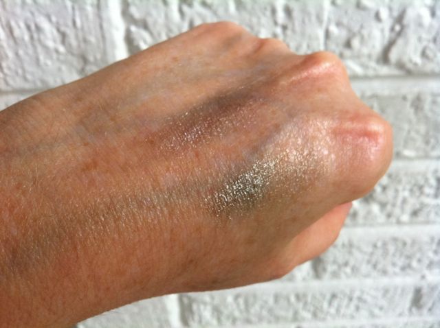
Illusoire on top, Epatant on the bottom
As you can see, these shades can be quite subtle and lovely.
The makeup artist at the Chanel boutique in Chicago showed me some of the Illusion D'Ombre shades applied with a brush, and they are gorgeous. Really incredible looking. (I was very taken with Ebloui, a lighter shade of mauve-lilac, but I didn't buy it.)
There are two limited-edition shades of powder blusher: Joues Contrast Rouge in Rouge and Or. Which means red and gold. And they are:

Here's a close-up of each shade:


Amazingly enough, they can be quite subtle. Especially for colors that look like two-thirds of a traffic light, No, really. I first applied them to my hand with my Lancome skunk brush and I couldn't even see the colors. I went over my original application using the brushes that came in the compact, and the colors were still pretty subtle. Finally I went all out, applying the gold shade and then lots of red on top, for a full-on scarlet fever look. And even then, it's not as clown-like as you'd think.

Finally, I bought a bottle of Peridot nail polish. Lately, Chanel polishes always seem to start a crazy lemming rush, and I wanted to grab a bottle before they were sold out. (In fact, now that I think about it, I was inspired to hit the Chanel website in the first place because I saw a bottle of Peridot for sale on ebay for some ridiculous amount of money--$45 or so.)
The picture in the eBay auction was what you'd expect a polish called Peridot to look like--a light yellow-green. In actuality, the polish flashes teal and gold and is never actually stays still long enough to look green, if that makes sense. I don't know whether I'll ever want to wear it; I may exchange it for a bottle of Quartz, which looks like Particulière with very fine shimmer.
At any rate, I tried to give you a sense of what Peridot polish looks like:


But I finally decided I needed to let you see the bottle in action. So here you go--my first mini video review.
To sum up, I'd say the entire collection is drop-dead gorgeous, but not every product is worth buying. Illusions Dombre are definitely worth a look; so is the Topkapi Quad, if you don't already have a ton of brown, beige, and gold shadows. The gold shadow is gorgeous and can be applied lightly or sponged on for a very dramatic effect. The nail polishes are interesting, and I'd suggest taking a look at Graphite, a medium gray with lots of silver microglitter, or Quartz, a taupey-beigey brown with tiny particles of micro glitter. Both are probably more wearable than Peridot. The limited edition blushes are interesting, and if you're a real makeup maven, you'll want to add these unique shades to your collection, but as for wearability and general usefulness. And the lipsticks are beautiful, but probably not worth getting.
(Just watch as a huge lemming rush starts over gold blush and fuschia lipstick!)
Monday, June 21, 2010
Eye shadow as contour: the theory
I'm probably getting really repetitive on the subject of neutral eyeshadow, but Sephora keeps filling my mailbox with catalogs showing models wearing truly outlandish colors--glittery turquoise stripes were featured in the latest--so it doesn't look as though I'll be shutting up any time soon.
So I'll say it again: neutral eye shadows are fantastic on women of a certain age. They do what eye shadow is supposed to do; shadow and sculpt the eyes to make them look bigger, brighter, and more expressive.
They do this by contouring the eye area. Now, it took me a long time to accept the fact that I was going to talk about using eye makeup to contour the eye area, because the old school notions of contouring seem hopelessly out of date.
You know what I mean when I talk about contouring the face with makeup, right? It's a makeup technique where you apply lighter makeup where you want a feature to appear higher or more prominent, and darker makeup where you want a feature to appear deeper or less prominent.
It's frequently used to make noses appear straighter and narrower, or make cheekbones look more prominent. But here's the thing about contouring: it's hard to make it look natural. It was first used in stage makeup, where the audience is very far away from the actors. Then it was used in black and white movies and stills, where you have dramatic lighting and a general aura of glamorous artificiality. But even then, makeup artists had to know what they were doing. Back then--and right now--when you shade and highlight an area, it's all about blending and soft, subtle shades.
As an example of what I'm talking about, take Marlene Dietrich. Her entire face was nothing but makeup and lighting. Here's a photograph of her standing next to Josef von Sternberg, the director who made her a star.

Notice the fairly flat planes of her face. Now look at her with von Sternberg's trademark lighting and a full face of contoured makeup:


I'm not a makeup artist, and I don't know how to do stage or film makeup, but it's pretty clear that Dietrich is wearing way more makeup than even the average Hollywood star of the 1930s--and they wore plenty.
Check out the contouring. I'm no expert, but I can see that a lighter shade of foundation is blended down the middle of her nose, with a darker shade along the side. In the first picture, it looks like she's wearing highlighter under her eyes, and in the second, it's obvious that the artist used rouge to contour her cheekbones (a trick that works very well in black and white photography, but is much less successful in color photographs or real life.)
Take at Dietrich's eye makeup. Her eyebrows are the stuff of legend, so we won't discuss them, except to warn you not to emulate her. Although tweezing her eyebrows off and drawing them on again much higher up did give Dietrich a much larger area in which to apply eyeshadow.
And what eyeshadow! She's wearing a medium shade from the lash line all the way up to the brows, with a lighter shade on the eyelid and a highlighting shade in the inner corner and in a narrow line under the eye. Her crease is shaded much darker. Her eyes are very wide set, and that, added to the increased height of her brow area, means the makeup artist could apply a ton of dark shadow in the U-shaped crease to the back wedge. Her eyes were big to begin with, but the eyeshadow makes them incredible.
And Dietrich was doing this before eyeshadow was commercially available. Instead, she or her makeup artist used soot mixed with baby oil or petroleum jelly.
There, now. Aren't you ashamed that you're not taking full advantage of the lovely, hygienic ready-made shades now available in stores?
Next on The Beauty Boomer: What I Do, or, I know Poppy Buxom, and she's no Marlene Dietrich.
Elsewhere on the web:
For more on makeup in films, see the article on makeup in Film Reference
For how to look more like Marlene Dietrich, go this article in Suite 101
So I'll say it again: neutral eye shadows are fantastic on women of a certain age. They do what eye shadow is supposed to do; shadow and sculpt the eyes to make them look bigger, brighter, and more expressive.
They do this by contouring the eye area. Now, it took me a long time to accept the fact that I was going to talk about using eye makeup to contour the eye area, because the old school notions of contouring seem hopelessly out of date.
You know what I mean when I talk about contouring the face with makeup, right? It's a makeup technique where you apply lighter makeup where you want a feature to appear higher or more prominent, and darker makeup where you want a feature to appear deeper or less prominent.
It's frequently used to make noses appear straighter and narrower, or make cheekbones look more prominent. But here's the thing about contouring: it's hard to make it look natural. It was first used in stage makeup, where the audience is very far away from the actors. Then it was used in black and white movies and stills, where you have dramatic lighting and a general aura of glamorous artificiality. But even then, makeup artists had to know what they were doing. Back then--and right now--when you shade and highlight an area, it's all about blending and soft, subtle shades.
As an example of what I'm talking about, take Marlene Dietrich. Her entire face was nothing but makeup and lighting. Here's a photograph of her standing next to Josef von Sternberg, the director who made her a star.

Notice the fairly flat planes of her face. Now look at her with von Sternberg's trademark lighting and a full face of contoured makeup:


I'm not a makeup artist, and I don't know how to do stage or film makeup, but it's pretty clear that Dietrich is wearing way more makeup than even the average Hollywood star of the 1930s--and they wore plenty.
Check out the contouring. I'm no expert, but I can see that a lighter shade of foundation is blended down the middle of her nose, with a darker shade along the side. In the first picture, it looks like she's wearing highlighter under her eyes, and in the second, it's obvious that the artist used rouge to contour her cheekbones (a trick that works very well in black and white photography, but is much less successful in color photographs or real life.)
Take at Dietrich's eye makeup. Her eyebrows are the stuff of legend, so we won't discuss them, except to warn you not to emulate her. Although tweezing her eyebrows off and drawing them on again much higher up did give Dietrich a much larger area in which to apply eyeshadow.
And what eyeshadow! She's wearing a medium shade from the lash line all the way up to the brows, with a lighter shade on the eyelid and a highlighting shade in the inner corner and in a narrow line under the eye. Her crease is shaded much darker. Her eyes are very wide set, and that, added to the increased height of her brow area, means the makeup artist could apply a ton of dark shadow in the U-shaped crease to the back wedge. Her eyes were big to begin with, but the eyeshadow makes them incredible.
And Dietrich was doing this before eyeshadow was commercially available. Instead, she or her makeup artist used soot mixed with baby oil or petroleum jelly.
There, now. Aren't you ashamed that you're not taking full advantage of the lovely, hygienic ready-made shades now available in stores?
Next on The Beauty Boomer: What I Do, or, I know Poppy Buxom, and she's no Marlene Dietrich.
Elsewhere on the web:
For more on makeup in films, see the article on makeup in Film Reference
For how to look more like Marlene Dietrich, go this article in Suite 101
Tuesday, April 27, 2010
The only eyeshadow shades you need
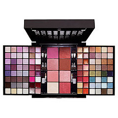
You know those fabulous blockbuster palettes that everyone comes out with for the holidays? Estee Lauder, Sephora, Walgreen's, you name it. A whole rainbow of colors and so many finishes: matte, satin, frosted, opalescent, glittery. How fun are they?
Great fun. But let's remember eyeshadow's primary purpose. It's not to go all Crayola 64 shades. Eye shadow exists to sculpt, enlarge, and accentuate the eye.
Say hello to the idea of Your Eyes But Better
If you want startling effects, you'll need a range of different colors of eyeshadow. But if you want to do a neutral, pretty makeup job--your eyes but bigger, brighter, more defined and more expressive--you only need three shades of shadow:1. A light, non-shimmery base color
 This shade should be about the color of your brow bone. You'll be applying it all over the eyelid, from lashline to eyebrow. This sets your concealer or primer, mattifies the area, and provides a base for the rest of your eye look.
2. A darker, non-shimmery midtone/contour shade for sculpting
 The midtone or contour shade should be two shades darker than your light shade. This is where fair-skinned girls get gypped. The contour shade in the average quad is usually far too dark. You really only want it to be a couple of shades darker than your light shade. Think about the way paint companies show shades on paint strips--the difference in color should be visible, but subtle.
3. A very dark shade for lining and special effects
 The dark shade should be somewhere between your contour shade and your eyeliner and/or eyelashes.
To those shades, it's also nice to add
4. A light shimmery highlight color

OK, I realize this comes as news to absolutely no one. I swear, as I type this, I'm picturing my makeup-obsessed internet friends rolling their (perfectly made up) eyes and saying "duh." After all, every eyeshadow manufacturer from Maybelline to Chanel produces a quad with four beige-to-chocolate brown shades.
Except that the companies often act as thought these quads were one size fits all, when they're really not.
Beware of Shimmer
You'll find lots of quads with absolutely gorgeous colors--except the shadows are all shimmery. Shimmery shadows are fine for certain uses, but for this natural, neutral eye, you want to shape and sculpt the lid, browbone, and crease, and you can't do that with sparkly shadows.Also, once you have even a hint of droopiness, crepey-ness or crows' feet, you have to approach shimmery shadows with extreme caution. (This is because--to revert to my paint metaphor--you don't use high-gloss, light-reflective paint formulas on a cracked surface!)
Work with your complexion
Here's another way in which eyeshadow quads aren't one-size-fits-all: the four shades you select should relate to your complexion shade and tone. I'm not talking about eye color here; this advice holds no matter what color your eyes are.You're using these shades to contour the area around your eyes, and they need to work with the color of your skin. As a fair-skinned, cool-to-neutral person, I've found many eye quads to be way too dark or too yellow toned. Often the lightest shade is fine, but the midtone or contour shade is the color of Grey Poupon mustard. Nothing against you mustard-colored ladies, but not only is Grey Poupon-colored eyeshadow unattractive, it looks unnatural. On me, at least.
If you're medium-to-dark-toned, you'll have to watch out for the lighter shades. Often the'll be too light, and end up looking ashy and unnatural. And if you're warm-toned, too taupe-y and cool a shade will look muddy.
Ideally all four eyeshadow shades blend together to create a soft, natural, big-eyed look--which is why I call it Your Eyes But Better.
My Recommendations
When you're looking for a set of eye shadows, it's tempting to buy a ready-made quad. But as I've already pointed out, I've never had much luck with that; it's awfully hard to escape shimmer, and the contour shade is too dark and warm a brown.However, quads can definitely be cost-effective, as opposed to buying four single shades. Bobbi Brown makes amazing shadows, but they're $20 each, so I hesitate to order you to run out and buy four of them. Still, if you click over there to check out the colors, you'll see how soft and subtle they are. That's the look we're aiming for.
There's also the advantage that someone else has coordinated the colors for you, which is helpful if you're a beginner.
Here are my suggestions:
Drugstore Quads
Revlon's Colorstay 12 Hour Eye Shadow Quad in Coffee Bean
Physician's Formula Canyon Classics and Classic Nudes

Department Store
Clinique's Color Surge Eye Shadow Quad in Teddy Bear. Spicy and Choco-Latte are also beautiful, and would work well with people with warmer and darker complexions.
Elizabeth Arden Color Intrigue Eye Shadow Quad in Sueded Browns or Neutral Cashmeres.

Creating the perfect eyeshadow quad
As you can see, sometimes a quad has one or two or even three gorgeous colors, but it doesn't have everything you need. Once you know the shades that work best for you, it's a great convenience to fill a compact with them.M.A.C. sells empty four- and fifteen-pan compacts. If you get a four-pan, you could fill it with shadow that work perfectly for you. This is something to keep in mind if you've tried one or two ready-made quads and found you only used two or three of the shades. A custom compact is really wonderful for travel, and it really simplifies life to open one compact and find everything you need.
My favorite eye shadow palette? Glad you asked
OK, this is definitely a case of do as I say, not as I do, because my favorite eyeshadow "quad" has nine shades of shadow. It's Too Faced's Natural Eye Neutral Eye Shadow Collection.
It has a perfect base color (top left) and the all-time fabulously wonderfully perfect crease shade for me (top middle). It also has some great shades to use as eye liner, and some shimmery and glittery shades to use for evening, so it's basically one-stop shopping. It retails for $34, but since you get nine shades, I think it's a pretty good deal.
(Confession time: I've also taken the plunge and ordered a M.A.C. 15-pan palette. Of neutral colors. Heh.)
Coming up soon: how and where to apply your eyeshadow.
Elsewhere:
MakeupGeek has two helpful videos that relate to this post, Makeup 101: How to Apply Eye Makeup, and How to Organize Your MAC Neutral Palette
Thursday, April 1, 2010
30 Days to 10 years younger--10 minute tips. Tip 28: Move on
 I've been doing the internet beauty thing for a long time, and one thing remains constant; people always find a way to whine about their favorite products being discontinued.
Sometimes a company pulls a line before giving it enough time to find its market segment. Firefly and Dollhouse fans have nothing on the women I know who keened, wailed, and gnashed their teeth when Oil of Olay decided to pull their line of drugstore makeup.

I'm going to sound like Pollyanna here, but honestly, things change incredibly quickly in the realm of cosmetics and skincare. If you take the time to remain informed about what's out there, you'll realize that formulations change. And it's not just due to business reasons. And a lot of the time, a new and improved formula actually is an improvement.
I urge you not to stockpile huge amounts of a favorite product. One of my invisible internet friends did just that with Oil of Olay's discontinued powder foundation. She was convinced that it was the perfect color match and the perfect consistency for her skin. But long before she had depleted her stockpile, fashion and her skin had moved on. What had once seemed perfect now appeared too heavy and matte.
That's because the finish and consistency of makeup changes as fashions change. The foundation that worked perfectly for you in 2003 might be way too matte and too opaque now that sheerer, light-diffusing formulas are in style.
If you're reaching the end of a product that you like, don't automatically repurchase the same thing. Do a little research to see what's new.
For example, there's an exciting-sounding partnership between CoverGirl and Olay that combines the color expertise of CoverGirl with the anti-aging formulas of Oil of Olay.

And I just discovered the world's most amazing foundation (for real, and don't let the other nine tubes and bottles in my bathroom tell you any different) by buying a ridiculous iPod train case from Stila. Stila's One Step foundation is primer, foundation, powder, true love, and fresh-baked cookies in one easy to use pump bottle. A tiny pea-sized bit of this miracle product erases my circles and broken capillaries and leaves me poreless and glowing.
And I'd never know about it if I'd been on auto-pilot and repurchased my third tube of Estee Lauder tinted moisturizer. So do your skin a favor and branch out. If you're wearing a foundation that's been out for 10 years or more, you really owe it to yourself to try something new. You won't believe the difference in the new stuff.
Elsewhere:
To see The Beauty Alchemist's review of Stila One Step foundation, click here.
To see About.com's Top Five Foundations for Women Over 40 click here
For more suggested foundations for mature skin on About.com, click here
If you haven't joined MakeupAlley, I urge you to do so.
Subscribe to:
Posts (Atom)